library(tidyverse)
library(knitr)
# setting a random seed for reproducibility
set.seed(1766)#3 Queuing and Animations (Amazon Returns)
14:540:384: Simulation Models in IE (Spring 2025)
Abstract
This document shows some basics about how to leverage Quarto to make your life easier and how to create some neat animations.
Questions
Notice this was excluded from the Table of Contents and is not numbered.
Recap
- Observed how simple problems can require simulation
- Set up a Quarto document for R, downloaded data, and generated some visualizations
- Fit various distributions to data and evaluated the best fit
Learning Objectives
- Control output and content of Quarto cells
- Create and run a basic queueing simulation
- Plot results
- Create an animation of the queue process
1 Quarto Controls
1.1 Front Matter
---
title: "R3 Waiting in Line"
subtitle: "14:540:384: Simulation Models in IE (Spring 2025)"
author:
  - name: Daniel Moore
    email: daniel.l.moore@rutgers.edu
    affiliation:
      - name: Rutgers University
        city: Piscataway
        state: NJ
        url: https://sites.rutgers.edu/ropes-lab/

date: 2025-02-04
image: "../assets/queue_plot.jpeg"
date-format: iso

format:
  pdf:
    number-sections: true
    toc: true
    toc-depth: 3
    number-depth: 3
    output-file: R3_pdf
    df-print: kable

abstract: This document shows some basics about how to leverage Quarto to make your life easier and how to create some neat animations.
---
1.2 Cell Options
#| eval: true       # whether to execute code when you render the doc
#| echo: false      # decide if code is shown in the document or hidden
#| output: false    # should the output of the chunk be displayed
#| warning: false   # do you want warnings to be shown in the document
#| error: false     # do you want error messages to apepar in the doc?
#| include: false   # Catch all for preventing any output
1.3 Formulas and references
- create a cross referencable item with
#fig-your-reference-name. Use the appropriate reserved prefix such as:fig,tbl,lst,tip,nte,wrn,imp,cau,thm,lem,cor,prp,cnj,def,exm,exr,sol,rem,eq,sec. - link words in your reference with
-. Do not using blank space, , or underscores_. - Reference your item where you want with
@fig-your-reference-name. - See the Quarto References Guide for how to get different formats of your reference such as: “Figure 1”, “Fig 1”, “1” etc.
The probability density function (pdf) of the exponential distribution is
given below in @eq-exponential-distribution.

$$
p(t) = \lambda e^{-\lambda t}
$$ {#eq-exponential-distribution}
The probability density function (pdf) of the exponential distribution is given below in Equation 1.
\[ p(t) = \lambda e^{-\lambda t} \tag{1}\]
2 Bank Queuing Simulation
2.1 Problem Definition
From 4:00 PM to 7:00 PM, customers arrive at Whole Foods to make Amazon returns following a Poisson process with a rate of \(\lambda = \frac{1\ customer}{3\ min}\). A single clerk services the returns at a rate of \(\mu = \frac{1\ customer}{2\ min}\).
What can we say about the:
- Expected wait time?
- Expected total time in the system?
- What is the probability of seeing more than 5 people in line?
- Server Utilization Rate?
2.2 Coding the simulation
- For previous examples, we stepped through time and sampled the random variables, keeping track of the results
- For this example, we will sample all the random variables and perform some logic to determine the results
- This method is more computationally efficient because loops can slow down R and Python
- On the one hand, sampling the random variables this way is more convincing because the memoryless property of the exponential distribution can be a hard concept to grasp and we are kind of pushing that issue out of the way
- On the other hand, this method requires a little more reasoning about what is happening in the system after the random variables are sampled
2.2.1 Packages
2.2.2 Parameters
lambda <- 1/3
arrive <- function(n=1) {
  rexp(n, rate = lambda )
}

mu <- 1/2
service <- function(n=1) {
  rexp(n, rate = mu)
}

t_f <- 3 * 60

# double the number of samples to make sure we will have enough to exceed t_f
samples <- round(2 * t_f * lambda)
2.2.3 Generating Arrival and Service Times
data <- tibble(
  interarrival_time = arrive(samples),
  service_time = service(samples)
)

data <- data |> mutate(
  arrival_time = cumsum(interarrival_time)
)

data <- data |> filter(arrival_time <= t_f)

data <- data |> mutate(
  service_start_time = 0,
  departure_time = 0)
2.2.4 Running the Simulation
t_0 <- 0
next_available_time <- t_0

for (i in 1:nrow(data)) {
  # Service starts when the server is available
  data$service_start_time[i] <- max(data$arrival_time[i], next_available_time)

  # Compute departure time
  data$departure_time[i] <- data$service_start_time[i] + data$service_time[i]

  # Update when the server wœill next be available
  next_available_time <- data$departure_time[i]
}
2.2.5 Calculating Performance Measures
data <- data |> mutate(
  wait_time = service_start_time - arrival_time,
  total_time = departure_time - arrival_time
)

data <- data |> mutate(
  number_serviced_by_arrival = 0,
  L = 0, # number in system, waiting + being serviced. Starting at 0
  L_q = 0 # number in queue
)

for (i in 2:nrow(data)) {
  this_arrival <- data$arrival_time[i]
  data$number_serviced_by_arrival[i] <- sum(data$departure_time[1:i-1] < this_arrival)
}

for (i in 1:nrow(data)) {
  data$L[i] <- i - data$number_serviced_by_arrival[i]
  data$L_q[i] <- max(0, data$L[i] - 1)
}

head(data)| interarrival_time | service_time | arrival_time | service_start_time | departure_time | wait_time | total_time | number_serviced_by_arrival | L | L_q |
|---|---|---|---|---|---|---|---|---|---|
| 0.6624587 | 5.2966049 | 0.6624587 | 0.6624587 | 5.959064 | 0.0000000 | 5.2966049 | 0 | 1 | 0 |
| 9.3129468 | 2.5289920 | 9.9754055 | 9.9754055 | 12.504397 | 0.0000000 | 2.5289920 | 1 | 1 | 0 |
| 0.3265047 | 2.9688180 | 10.3019102 | 12.5043975 | 15.473216 | 2.2024873 | 5.1713053 | 1 | 2 | 1 |
| 0.2567624 | 2.1481199 | 10.5586726 | 15.4732155 | 17.621335 | 4.9145429 | 7.0626628 | 1 | 3 | 2 |
| 0.5007908 | 1.0292805 | 11.0594634 | 17.6213354 | 18.650616 | 6.5618719 | 7.5911524 | 1 | 4 | 3 |
| 7.1882326 | 0.4291179 | 18.2476961 | 18.6506159 | 19.079734 | 0.4029198 | 0.8320377 | 4 | 2 | 1 |
Note that this table will look bad in the PDF. We’ll explicitly use kable() to make it look better. Look at Table 1 to see compare the outputs.
kable(head(data), digits=2, col.names =
c("Interarrival Time", "Arrival Time", "Service Time", "Service Start Time", "Departure Time", "Wait Time", "Total Time", "Serviced by Arrival", "L", "L_q"))| Interarrival Time | Arrival Time | Service Time | Service Start Time | Departure Time | Wait Time | Total Time | Serviced by Arrival | L | L_q |
|---|---|---|---|---|---|---|---|---|---|
| 0.66 | 5.30 | 0.66 | 0.66 | 5.96 | 0.00 | 5.30 | 0 | 1 | 0 |
| 9.31 | 2.53 | 9.98 | 9.98 | 12.50 | 0.00 | 2.53 | 1 | 1 | 0 |
| 0.33 | 2.97 | 10.30 | 12.50 | 15.47 | 2.20 | 5.17 | 1 | 2 | 1 |
| 0.26 | 2.15 | 10.56 | 15.47 | 17.62 | 4.91 | 7.06 | 1 | 3 | 2 |
| 0.50 | 1.03 | 11.06 | 17.62 | 18.65 | 6.56 | 7.59 | 1 | 4 | 3 |
| 7.19 | 0.43 | 18.25 | 18.65 | 19.08 | 0.40 | 0.83 | 4 | 2 | 1 |
We could also break this table up into a few different groups of columns so that it fits on the page nicer. This is good enough for us for now.
2.3 Visualizing the Results
2.3.1 Queue Length Histogram
Figure 1 shows the distribution of queue lengths.
data |> ggplot(aes(x=L)) +
  geom_histogram(fill="cornflowerblue", color="black") +
  labs(
    title = "Queue Length Histogram",
    x = "Number of Customers in Queue",
    y = "Count"
  )
`stat_bin()` using `bins = 30`. Pick better value with `binwidth`.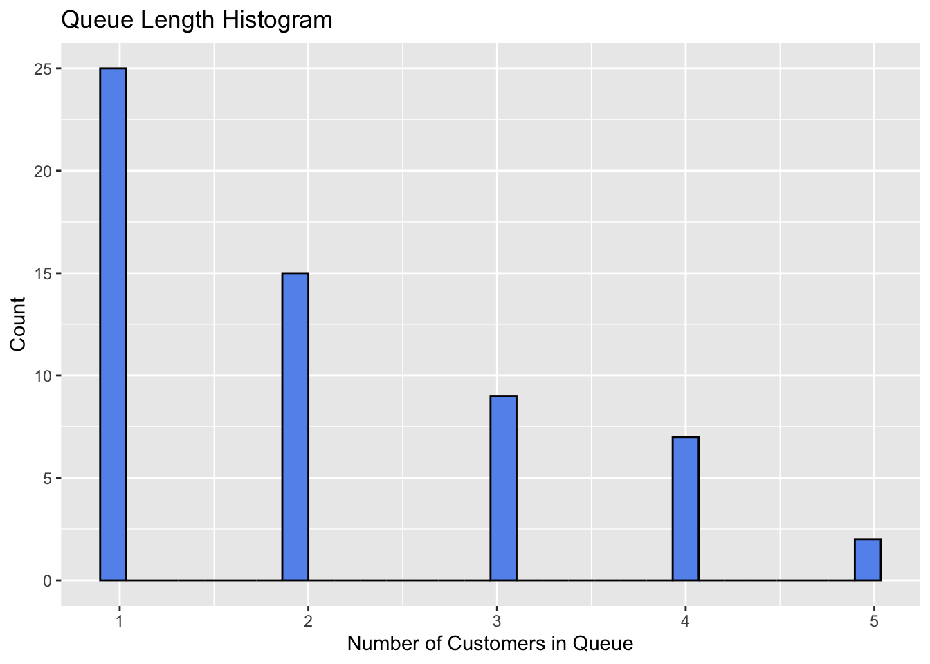
2.3.2 Waiting Time Histogram
Figure 2 shows the distribution of waiting times.
data |> ggplot(aes(x=wait_time)) +
  geom_histogram(fill="cornflowerblue", color="black") +
  labs(
    title = "Waiting Time Histogram",
    x = "Waiting Time (min)",
    y = "Count"
  )
`stat_bin()` using `bins = 30`. Pick better value with `binwidth`.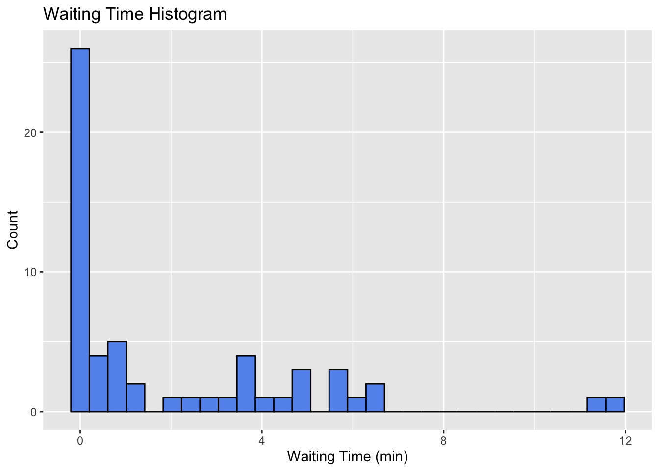
2.3.3 Waiting Time Density
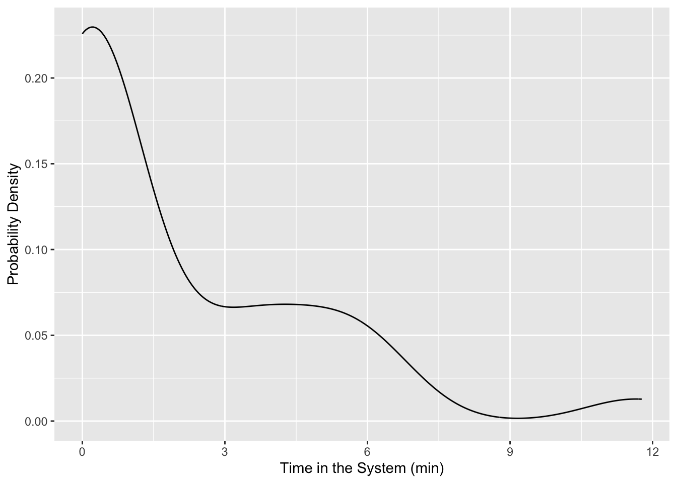
If we want to view any of these as a probability density we could use stat_density or geom_density. There are a whole host of different plots that you should browse to see what could be good at telling the story you are trying to convey.
data |> ggplot(aes(x = wait_time)) +
  geom_density() +
  labs(
    x = "Time in the System (min)",
    y = "Probability Density"
  )
2.3.4 Queue Length Over Time
Figure 5 shows the queue length over time. However, this isn’t really the full story. What we want to see is how the system changes at each arrival and departure. To do this, we will need to create a new data frame that has an entry for each arrival and departure. Additionally, we’ll want the numbers indicated to be horizontal lines with discontinuities showing when the number changes. Also, this is not exactly the bounds of our simulation because we cutoff our arrivals at \(t_f\), but we have departures after that time. So we should only be plotting up to \(t_f\).
data |> ggplot(aes(x=arrival_time, y=L_q)) +
  geom_line(color="cornflowerblue") +
  labs(
    title = "Queue Length Over Time",
    x = "Time (min)",
    y = "Number of Customers in Queue"
  )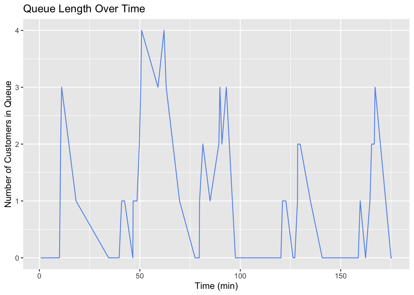
The way these lines are connected give an indication that the queue length is in between two integers at most times. Line plots can be misleading in this way. We need a step plot. Also, we are essentially only sampling the system at a time that somebody arrives. This is why we are seeing big jumps. We should only be seeing the line move up or down one at a time.
Event Log
Basically, we need to unpack the simulation data so that it is event-centric rather than customer-centric.
# all events are either arrivals or departures
# create a dataframe which tracks all events
# combines arrival and departure times into single vector, event time
# for arrivals, event is +1
# for departures, event is -1

events <- data |>
  # bringing the data I want to work with
  select(arrival_time, departure_time) |>

  # turning the data from wide to long
  pivot_longer(
    cols = everything(),
    names_to = "event_type",
    values_to = "event_time") |>

  # assigning -1 if departure and 1 if arrival
  mutate(
    event = ifelse(event_type == "arrival_time", 1, -1)) |>

  # adding an initial condition of time=0 and 0 customers
  bind_rows(tibble(event_time = 0, event = 0)) |>

  # removing the event type column
  select(-event_type) |>

  # sorting the data by event time
  arrange(event_time)

# cumulative sum of events
events <- events |> mutate(
  L = cumsum(event),
  # pmax is vectorized function that looks at each element rather than the entire thing
  L_q = pmax(0, L - 1)
)

head(events)| event_time | event | L | L_q |
|---|---|---|---|
| 0.0000000 | 0 | 0 | 0 |
| 0.6624587 | 1 | 1 | 0 |
| 5.9590636 | -1 | 0 | 0 |
| 9.9754055 | 1 | 1 | 0 |
| 10.3019102 | 1 | 2 | 1 |
| 10.5586726 | 1 | 3 | 2 |
We could plot this by adding each column to the plot one at a time, but this can get messy. Instead we’ll do a pivot_longer so that the data is in a better format for plotting multiple series together.
Here I’m pivoting from a wide format (have both an L and an L_q column) to a long format which just has the x-value of time and the y-value of L or L_q. This makes plotting much easier.
events_long <- events |>
  pivot_longer(
    cols = c(L, L_q),
    names_to = "metric",
    values_to = "value"
  )

head(events_long)| event_time | event | metric | value |
|---|---|---|---|
| 0.0000000 | 0 | L | 0 |
| 0.0000000 | 0 | L_q | 0 |
| 0.6624587 | 1 | L | 1 |
| 0.6624587 | 1 | L_q | 0 |
| 5.9590636 | -1 | L | 0 |
| 5.9590636 | -1 | L_q | 0 |
At last, Figure 5 shows a complete plot of the number of customers in line and the number in the system at each moment.
events_long |> ggplot(aes(x = event_time, y = value, color=metric)) +
  xlim(0, t_f) +
  geom_step(direction = "hv") +
  labs(
    title = "Customer Count Over Time",
    x = "Time (min)",
    y = "Customers"
  ) +
  theme_minimal()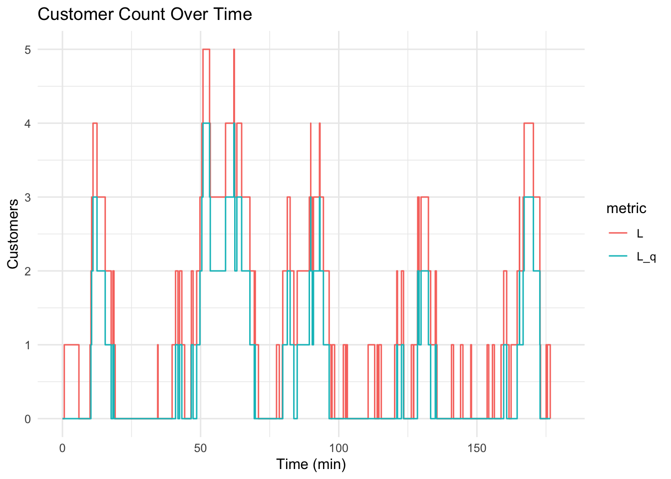
3 Animation
3.1 Concepts
- Data in long format: Structure data with one row per observation and a time variable for animations (use pivot_longer() for multiple metrics).
- Time variable for transitions: Use a continuous variable (e.g., event_time) to animate data over time with transition_reveal() or transition_states().
- Compatible geom layers: Use geom_step(), geom_line(), or geom_point() to animate time-series data, ensuring smooth transitions.
3.2 Code
library(gganimate)
library(gifski)
Note that I have this cell set up to not execute with #| eval: false. I used this exact code to create and save the plot as shown, but I don’t want to re-render and save over it every time.
p <- events_long |>
  ggplot(aes(x = event_time, y = value, color = metric)) +
  geom_step(size = 1.2) +
  labs(x = "Time", y = "Customers", color = "Metric") +
  theme_minimal() +
  transition_reveal(event_time)

# Animate and save as GIF
anim <- animate(p, renderer = gifski_renderer(),
  width = 800, height = 600, duration = 5)
anim_save("returns_animation.gif", animation = anim)

anim
4 Analytical Solution
These metrics are the typical things we want to know about queues. How long will I wait? What’s the probability of the line having more than 4 people? How long will I be in this line before it’s my turn? etc.
They are derived from algebraic manipulations of the probability density functions. They are specific for an \(M/M/1\) queue which is “Kendall’s Notation” for a queue with:
- M: Exponential distributed Arrival Time (typically \(\lambda\))
- M: Exponentially distributed Service Time (typically $)
- 1: A single line, single server
- Implied is a first-in/first-out (FIFO) “service discipline”
What other service disciplines can you imagine? What settings?
4.1 Formulae
\[ Server\ Utilization, \rho = \frac{\lambda}{\mu} = \frac{1/3}{1/2} \tag{2}\]
\[ Expected\ Number\ in\ the\ System,\ L = \frac{\lambda}{\mu - \lambda} \tag{3}\]
\[ Expected\ Number\ in\ the\ Queue,\ L_q = \frac{\lambda^2}{\mu(\mu - \lambda)} \tag{4}\]
\[ Expected\ time\ in\ the\ System,\ W = \frac{1}{\mu - \lambda} \tag{5}\]
\[ Expected\ time\ in\ the\ Queue,\ W_q = \frac{\lambda}{\mu(\mu - \lambda)} \tag{6}\]
\[ Probability\ of\ empty\ system, P_0 = 1 - \rho \tag{7}\]
\[ Probability\ of\ n\ customers\ in\ the\ System,\ P(n) = (1 - \rho)\rho^n \tag{8}\]
4.2 Calculations
#
P_n <- function(n, rho) {
  (1 - rho) * rho^n
}

performance_measures <- data.frame(
  Performance_Measure = c("L", "L_q", "W", "W_q", "rho"),
  Analytical = c(
    lambda / (mu - lambda),
    (lambda^2) / (mu * (mu - lambda)),
    1 / (mu - lambda),
    lambda / (mu * (mu - lambda)),
    lambda / mu
  )
)
5 Simulation and Analytical Comparison
- How can we get these same performance measures from the simulated data?
5.1 Think Critically!
Think for a minute about the way our two data frames are structured. Is all of the information there? What do we need to consider to get it.
5.2 Performance Measure Notes
- The performance measures, \(L\) and \(L_q\) are supposed to represent the expected number of custoemrs in the system and in the queue
- The first data is customer centric. All we see is how many people are in line when the customer shows up. \(W\) and \(W_q\) are obtainable from this.
- The second is event centric. We see the time that an event happens and the customers at that time.
- This means essentially we are just sampling at these points. It might be a good representation of the number in the system, but it might not be. Notably, we could definitely have systematic error because this “sampling” isn’t even random, it is always as events
5.3 What to do?
- We need to take the time-weighted average of the number of people in the system and in line
- This data is available in the
eventsdata frame, but it will take a little more manipulation:
events <- events |> mutate(
  time_in_state = coalesce(lead(event_time), t_f) - event_time
)
Coalesce gives us a default value to use. Since we are differencing each row with the one after it, when we get to the last row there’s nothing there. So we need to say the last row’s lead even time is the end of the simulation, t_f.
performance_measures <- performance_measures |> mutate(
  Simulation = c(
    sum(events$L * events$time_in_state) / t_f,
    sum(events$L_q * events$time_in_state) / t_f,
    mean(data$total_time),
    mean(data$wait_time),
    sum(events$time_in_state[events$L > 0]) / t_f
  )
)
Now we can compare the analytical results in Table 2 and the correctly calculated simulation performance measures.
kable(performance_measures, digits = 3)| Performance_Measure | Analytical | Simulation |
|---|---|---|
| L | 2.000 | 1.190 |
| L_q | 1.333 | 0.643 |
| W | 6.000 | 3.692 |
| W_q | 4.000 | 1.995 |
| rho | 0.667 | 0.547 |
n_in_system_ps <- tibble(n = 0:10) |>
  mutate(
    Analytical = P_n(0:10, lambda/mu),
    Simulation = sapply(0:10, function(k) sum(events$time_in_state[events$L == k]) / t_f)
  )

kable(n_in_system_ps, digits=3)
# first we need to get the data into long format
n_in_system_ps |>
pivot_longer(
cols = c(Analytical, Simulation),
names_to = "method",
values_to = "p"
) |>
ggplot(aes(x = n, y = p, fill = method, group = method)) +
geom_bar(stat = "identity", position = "dodge") +
labs(x = "n", y = "Probability", title = "Probabilities by Method") +
theme_minimal()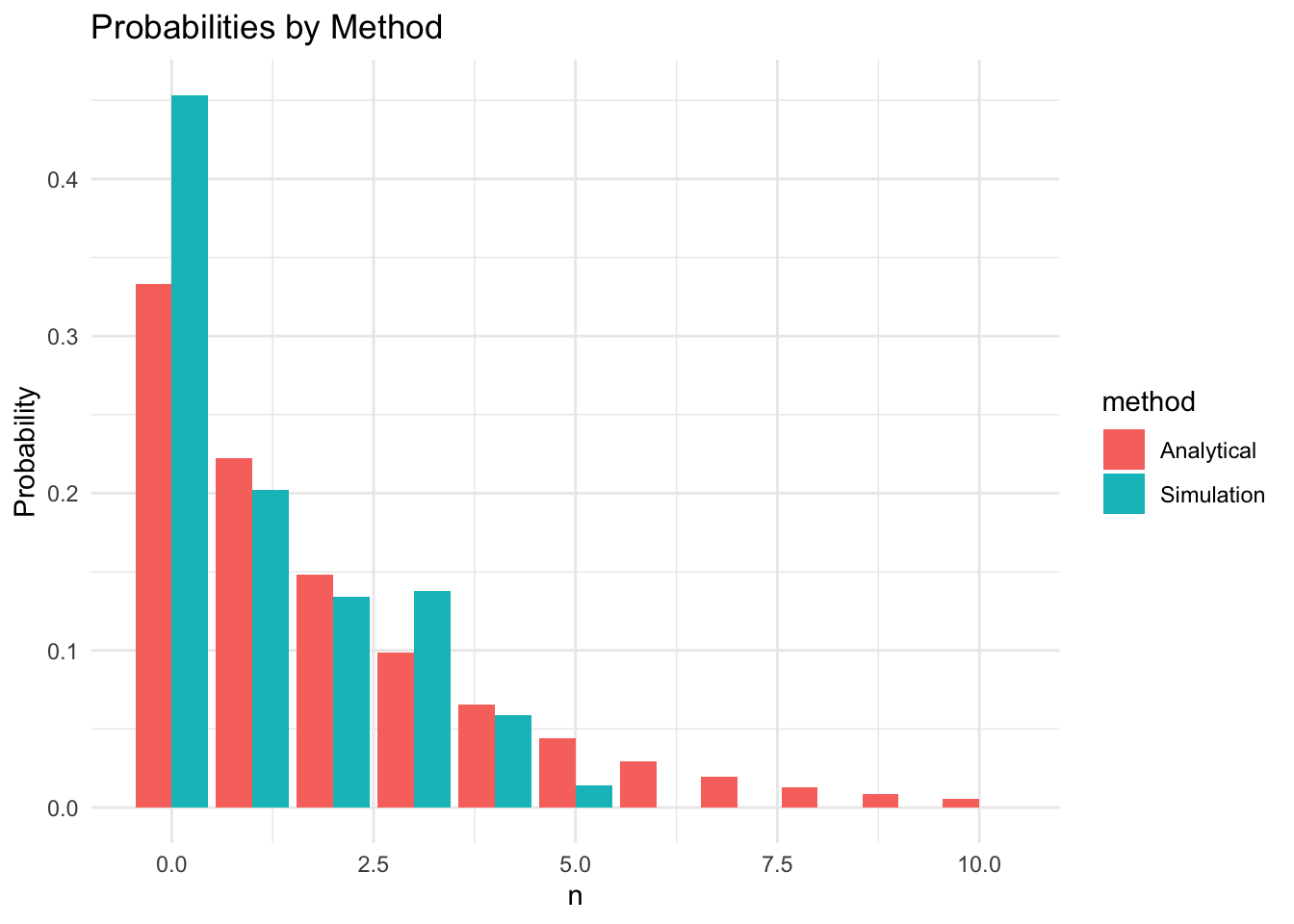
I’ll leave it to you to compare these results with an incorrect method which would be simply averaging from the sampled data or the events log without accounting for time.
6 Conclusion
6.1 Potential Complications?
- What if there is a limited amount of space and if the line is too long, customers just leave?
- Service times follow different distributions?
- More than one line? More than one server?
- Priority line with different logic? Maybe a commerical customer with 12 packages gets serviced as soon as a server is available?
6.2 Summary
- We simulated an \(M/M/1\) queuing system by sampling arrival and service times
- We obtained system state measurements by executing logic on the samples
- Manipulated the data into an event time series
- Created and animated
geom_stepplots usingggplot,gganimate, andgifski - Compared analytical system metrics to those we obtained from the simulation.
- Noted how we must account for time to get correct performance measures